Here the second of the two "manuals" introducing bookbinding subjects to school children that I recently received. They are both parts of the Technische Jugend Bücherei (Technical Library for Youths) edited by L.M.K. Capeller, instructor for art education at the teacher training institute in Munich. The first pamphlet Papparbeit (No. 17) was described in my previous post, and covered the subject of paper crafts such as desk accessories, calendars, boxes, ...
Buchbinden (No. 18) is the second that introduces bookbinding. Both were published in 1926. The structures that are introduced are the single-section pamphlet in a wrapper and the multi-section Pappband, or as it more commonly referred to in North America, Bradel binding. The appendix briefly describes sewing on sawn in cords rather than tapes, and suggests working with a carpenter to construct a sewing frame (diagram in book).
 |
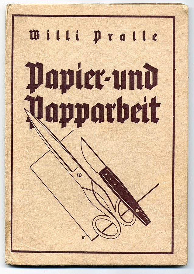
| The covers on these pamphlets are rather attractive, with the central decorative element representing a box. |
 |
| Title Page |
 |
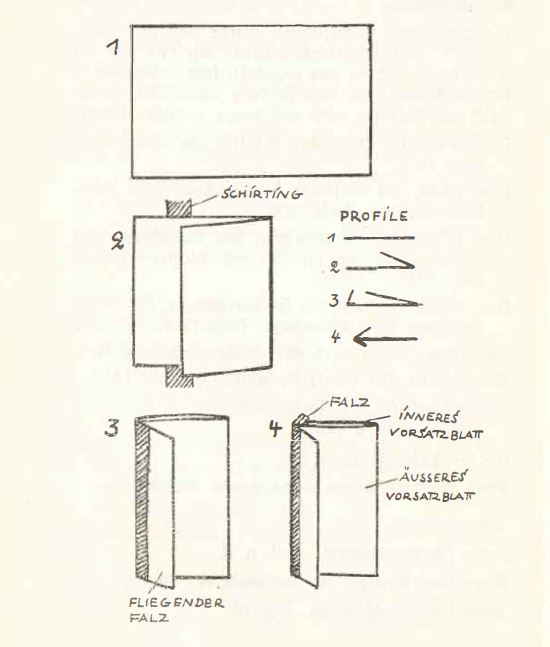
| Diagram for making the hooked endpaper out of a single strip. This will result in a pastedown, flyleaf, and guard/waste sheet that the cover will be built up on. This construction was also depicted in the post here. |
 |
| Starting the sewing. Note the position of the endsheet relative to the first signature. |
 |
| The diagram depicts the "gebrochene Rücken", referred to here as the Hülse (hollow). Per the text, it is made from two pieces, one the width of the spine, the other wider to attach it to the guard/waste sheet of the textblock. It is made of card stock, and rather than creasing and folding, it is scored, then folded. Do you know the difference between creasing and scoring? |
 |
| The Hülse attached to the guard/waste sheet. |
 |
| Next, the boards get attached. |
 |
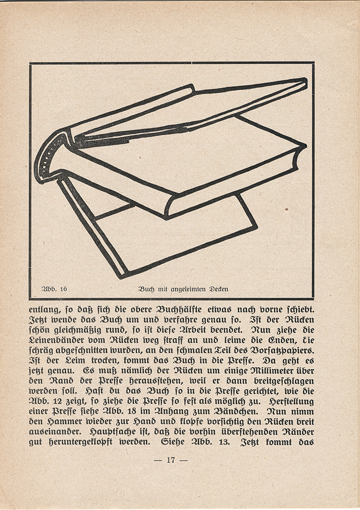
| Several presses are depicted in the booklet... After trimming the boards to size, Buchbinden ends by telling students that there is no need to describe covering as that was all described in the previous pamphlet Papparbeit. After covering it continues with paste out the paste down, close the cover onto the textblock and put in the press. |
Final tips: When starting out, sew on tapes, so you don't need a sewing frame, make sure you have lots of CLEAN wastepaper ready BEFORE starting each step, so you don't have to scurry to find a piece, also avoiding glue stains on the book... Then, make sure to have fun.
 |
| The back cover. |


.jpg)